Key Takeaways
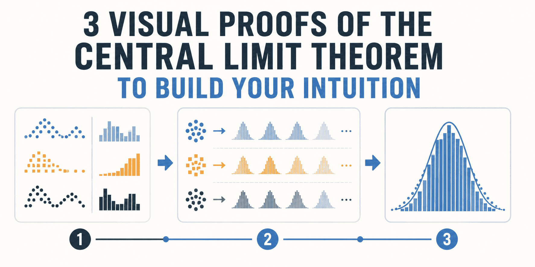
- The Central Limit Theorem (CLT) states that the distribution of sample means will approach a normal (bell curve) distribution, regardless of the original population's distribution, as the sample size increases.
- This fundamental statistical concept is crucial for understanding hypothesis testing, confidence intervals, and the behavior of many machine learning algorithms.
- Visual proofs, often done through simulations, offer a powerful way to build intuition by showing the bell curve emerge from various non-normal starting distributions.
- Key elements to grasp are the population distribution, individual samples, and the distribution of their means, which is where the magic of the CLT happens.
Understanding the Central Limit Theorem: Three Visual Proofs to Build Your Intuition
The world of data is vast and often messy. From the heights of people to the number of clicks on a website, data rarely fits neatly into perfect patterns. Yet, in the heart of statistics and data science, there's a powerful idea that brings order to this chaos: the Central Limit Theorem (CLT). If you've ever wondered why the "bell curve" appears so often, even when the underlying data looks nothing like it, the CLT holds the answer.
This article is for anyone diving into data science, machine learning, or just curious about how statistics works. We're going to break down the Central Limit Theorem not with complex equations, but with clear, easy-to-understand visual proofs. Our goal is to build your intuition, helping you truly
see why this theorem is so fundamental.
What Exactly is the Central Limit Theorem?
Before we jump into the visuals, let's quickly define the Central Limit Theorem. In simple terms, it says this:
Imagine you have any population of data – it could be uniformly distributed (like rolling a fair die), skewed (like income levels), or even something completely random. Now, if you take many, many random samples of a certain size from that population, calculate the mean (average) of each sample, and then plot all those sample means, what happens?
The Central Limit Theorem tells us that
the distribution of these sample means will tend to be normal (a bell curve), regardless of the original population's distribution, as long as your sample size is large enough.
That's quite a statement! It means that even if your original data looks like a jagged mountain range, the averages of small chunks of that data will start to smooth out into a familiar bell shape.
Why Does This Matter for Tech and AI?
The CLT is not just an academic curiosity. It's a cornerstone for many practical applications:
- Hypothesis Testing: Many statistical tests rely on the assumption that sample means are normally distributed. Without the CLT, we wouldn't be able to make reliable inferences about populations from samples.
- Confidence Intervals: When you see a "margin of error" in polls, the CLT is working behind the scenes to allow us to estimate a range where the true population mean likely falls.
- Machine Learning: While not directly applied in every algorithm, the principles of sampling and distribution underlying the CLT inform how we understand model performance, error distributions, and the robustness of various statistical models. For instance, understanding the distribution of errors in a regression model often involves concepts related to normality.
- Quality Control: In manufacturing, the CLT helps monitor processes by looking at the average quality of products in batches.
Now, let's get to the fun part: seeing the CLT in action.
Let's start with one of the simplest distributions: the uniform distribution. Imagine rolling a perfect six-sided die. Each number (1, 2, 3, 4, 5, 6) has an equal chance of appearing. If you plot the results of many rolls, you'd get a flat line – a uniform distribution. There's no bell curve here.
The Experiment:
- The Population: Our population is the outcome of a single die roll (numbers 1 through 6), where each outcome has a 1/6 probability. This is a uniform distribution.
- Taking Samples: We'll take many random samples from this population. For our first visual proof, let's say each sample consists of two die rolls (sample size n=2).
- Calculating Means: For each sample of two rolls, we calculate the average. For example, if we roll a 3 and a 5, the mean is (3+5)/2 = 4.
- Plotting the Means: We repeat this process thousands of times – take two rolls, find the average, and then plot that average on a histogram.
What You'll See (The Visual Proof):
Even with a small sample size like n=2, you'll immediately notice that the histogram of the sample means doesn't look uniform at all. It starts to form a triangular shape, which is the very beginning of a bell curve.
Why does this happen? Think about it:
- Getting an average of 1 (rolling 1, 1) or an average of 6 (rolling 6, 6) is quite rare.
- Getting an average of 3.5 (e.g., 1 and 6, 2 and 5, 3 and 4, 4 and 3, 5 and 2, 6 and 1) is much more common because there are more combinations of two dice that add up to 7 (giving an average of 3.5).
As you increase the sample size (n=3, n=5, n=30, etc.), the distribution of these sample means will get progressively closer to a perfect bell curve. This is the magic of the CLT beginning to show itself. The original uniform distribution is lost; the distribution of
its means becomes normal.
Visual Proof 2: The Exponential Distribution
Next, let's try a population with a highly skewed distribution. The exponential distribution is a great example. It's often used to model the time until an event occurs, like the lifespan of a lightbulb or the time between customer arrivals. It starts high and then quickly tapers off – definitely not a bell curve.
The Experiment:
- The Population: We generate a large number of random values that follow an exponential distribution. If you plot these values, you'll see a steep drop-off, with many small values and very few large values.
- Taking Samples: We'll take many random samples from this exponential population. Let's choose a sample size of n=5 for this round.
- Calculating Means: For each sample of 5 values, we calculate their average.
- Plotting the Means: We repeat this process thousands of times, collecting and plotting each sample mean.
What You'll See (The Visual Proof):
Even though the original population is heavily skewed, the histogram of the sample means will start to show a remarkable transformation. It won't be perfectly normal yet with n=5, but it will be much less skewed than the original exponential distribution. It will begin to centralize and take on a more symmetrical, bell-like shape.
If we were to increase the sample size to, say, n=30, the bell curve would become even more pronounced. This visually demonstrates that the original distribution's shape becomes less relevant as we average more and more data points in our samples. The "central tendency" of these averages starts to dominate.
Visual Proof 3: The Bernoulli Distribution (Coin Flips)
Let's consider an even more extreme case: a binary distribution, like flipping a coin. This is a Bernoulli distribution, where outcomes are either 0 (tails) or 1 (heads). There's no "curve" here at all – just two bars on a histogram.
The Experiment:
- The Population: Our population is the outcome of a single coin flip. Let's say heads = 1 and tails = 0. This is a Bernoulli distribution, the simplest possible distribution.
- Taking Samples: We'll take many random samples. Each sample will consist of, say, 30 coin flips (n=30).
- Calculating Means: For each sample of 30 flips, we calculate the mean. This mean represents the proportion of heads in that sample. For example, if you get 18 heads out of 30 flips, the mean is 18/30 = 0.6.
- Plotting the Means: We repeat this thousands of times – flip 30 coins, calculate the proportion of heads, and plot that proportion.
What You'll See (The Visual Proof):
This is perhaps the most striking visual proof. Despite the original data being just 0s and 1s, the distribution of the
proportions of heads (which are the sample means) will form a clear, beautiful bell curve.
The center of this bell curve will be around 0.5 (assuming a fair coin), because that's the expected proportion of heads. The spread of the curve will depend on the sample size – larger samples will have means clustered more tightly around 0.5.
This vividly illustrates that even from a population with only two possible outcomes, the act of repeatedly sampling and averaging transforms the distribution into the familiar normal shape.
How to "See" These Proofs Yourself (Conceptual Tutorial)
While we've described these proofs, truly building intuition comes from interacting with them. You don't need complex software to grasp the concept; simple programming languages are enough.
Here's a conceptual guide to how you might simulate one of these visual proofs, for instance, the uniform distribution example, using a tool like Python with libraries like NumPy and Matplotlib:
Step 1: Define Your Population
First, decide on your non-normal population. For the uniform distribution of a die roll, you can think of it as values from 1 to 6, each with equal probability.