Key Takeaways
- Automating descriptive statistics in Python saves significant time and effort in data analysis workflows.
- Pandas' built-in `describe()` method provides a quick summary of numerical and categorical data.
- Libraries like Sweetviz and YData-Profiling (formerly Pandas Profiling) offer comprehensive, interactive HTML reports with minimal code.
- Pandas Styler allows for advanced formatting of summary tables, making them publication-ready.
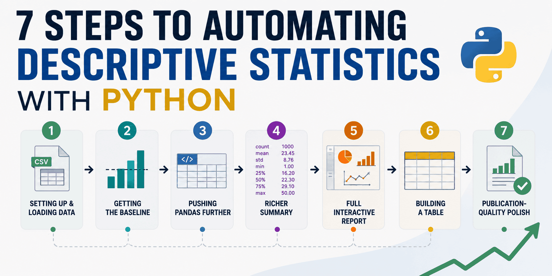
7 Steps to Automating Descriptive Statistics with Python
As a data professional, you know the drill: import your data, then spend ages writing repetitive lines of code to get basic summaries for each column. You manually call mean(), std(), min(), max(), and count unique values, often for dozens of features. This isn't just tedious; it's a huge time sink that keeps you from the more interesting parts of data analysis and model building.
What if you could cut down that manual work to just a few lines of code, generating rich, publication-ready summary tables automatically? This tutorial will show you exactly how to do that in Python, moving you from repetitive tasks to efficient, insightful data exploration. We'll cover everything from basic Pandas functions to powerful, dedicated profiling libraries, and even how to make your output look polished for sharing.
Why Automate Descriptive Statistics?
Descriptive statistics is the foundation of understanding your dataset. It tells you about the central tendency (where your data is centered), dispersion (how spread out it is), and the shape of your data's distribution. Before you can even think about building complex AI models, you need to know what your data looks like, identify potential issues like missing values or outliers, and understand relationships between features.
Manually performing these checks for every single column in a large dataset is not only inefficient but also prone to errors. Automation allows you to quickly generate comprehensive summaries, ensuring consistency and freeing up your time for deeper analysis. Libraries built specifically for this purpose can even provide data quality suggestions and visualize distributions, which are crucial steps in any data science project.
Step 1: Setting Up Your Python Environment
First things first, let's make sure you have the necessary tools installed. For this tutorial, we'll primarily use pandas for data manipulation and numpy for numerical operations. We'll also introduce some advanced profiling libraries later.
If you don't have them, you can install them using pip:
pip install pandas numpy
For the advanced profiling tools, you'll install them as we go.
Step 2: Loading Your Data
Let's start by loading a sample dataset. For demonstration purposes, we'll create a simple Pandas DataFrame. In a real-world scenario, you would typically load data from a CSV, Excel file, or a database.
import pandas as pd
import numpy as np

# Create a sample DataFrame
data = {
    'CustomerID': range(1, 11),
    'Age':,
    'AnnualIncome':,
    'SpendingScore':,
    'PreferredProduct': ['Electronics', 'Clothing', 'Electronics', 'Books', 'Clothing', 'Electronics', 'Books', 'Electronics', 'Clothing', 'Books'],
    'JoinDate': pd.to_datetime(['2022-01-15', '2022-03-20', '2021-11-01', '2022-02-10', '2021-10-25', '2023-01-05', '2022-04-12', '2021-09-01', '2022-05-30', '2021-12-18']),
    'HasLTV': [True, False, True, False, True, False, True, True, False, True]
}
df = pd.DataFrame(data)

# Introduce some missing values and duplicates for demonstration
df.loc[2, 'AnnualIncome'] = np.nan
df.loc[6, 'SpendingScore'] = np.nan
df = pd.concat([df, df.iloc[]], ignore_index=True) # Add a duplicate row

print("Original DataFrame Head:")
print(df.head())
print("\nDataFrame Info:")
df.info()
The df.info() method gives you a quick summary of your DataFrame, including data types and non-null values, which is a good starting point.
Step 3: The `describe()` Method – Your First Automation Step
The most basic and powerful function for getting descriptive statistics in Pandas is df.describe(). It automatically calculates various statistics for numerical columns and can also provide insights for non-numerical (object/categorical) columns.
# Get descriptive statistics for numerical columns
numerical_summary = df.describe()
print("\nDescriptive Statistics for Numerical Columns:")
print(numerical_summary)
By default, df.describe() provides:
count: Number of non-null observations.mean: The arithmetic average.std: Standard deviation, measuring data spread.min: Minimum value.25%: The 25th percentile (first quartile).50%: The 50th percentile (median).75%: The 75th percentile (third quartile).max: Maximum value.
Step 4: Customizing `describe()` for More Insights
The describe() method is flexible. You can include all data types or specify which ones to analyze using the `include` and `exclude` parameters.
# Describe all columns, including categorical ones
all_columns_summary = df.describe(include='all')
print("\nDescriptive Statistics for All Columns (including categorical):")
print(all_columns_summary)

# Describe only object (categorical) columns
categorical_summary = df.describe(include=['object', 'bool'])
print("\nDescriptive Statistics for Categorical/Boolean Columns:")
print(categorical_summary)

# You can also specify custom percentiles
custom_percentiles_summary = df.describe(percentiles=[.05, .25, .5, .75, .95])
print("\nDescriptive Statistics with Custom Percentiles:")
print(custom_percentiles_summary)
When you use `include='all'`, for non-numerical columns, describe() provides:
count: Number of non-null entries.unique: Number of distinct values.top: The most frequent value.freq: The frequency of the most frequent value.
Step 5: Beyond `describe()` – Grouped Statistics
Often, you'll want to understand descriptive statistics for different groups within your data. Pandas' groupby() method combined with aggregation functions is perfect for this.
# Group by 'PreferredProduct' and get average AnnualIncome and SpendingScore
grouped_stats = df.groupby('PreferredProduct').agg({
    'AnnualIncome': ['mean', 'median', 'std', 'min', 'max'],
    'SpendingScore': ['mean', 'median', 'std', 'min', 'max'],
    'CustomerID': 'count' # Count customers per product
})
print("\nGrouped Statistics by PreferredProduct:")
print(grouped_stats)
This allows you to see, for example, if customers preferring 'Electronics' have a higher average annual income or spending score compared to those preferring 'Clothing'.
Step 6: Advanced Automation with Profiling Libraries
While Pandas' native functions are powerful, dedicated profiling libraries take automation to the next level by generating comprehensive, interactive reports with a single line of code. These reports often include visualizations, correlation matrices, and warnings about data quality issues.
YData-Profiling (formerly Pandas Profiling)
YData-Profiling (previously known as Pandas Profiling) is an open-source Python package that extends the Pandas DataFrame with df.profile_report(). It generates detailed HTML reports that include type inference, essential statistics, quantile statistics, missing values analysis, correlation matrices, and more.
To install:
pip install ydata-profiling
Usage:
from ydata_profiling import ProfileReport

# Generate a profile report
profile = ProfileReport(df, title="Customer Data Profiling Report", explorative=True)

# Display the report in a Jupyter Notebook or save to HTML
# To display in notebook:
# profile.to_widgets()
# To save as HTML file:
profile.to_file("customer_data_profile.html")
print("\nYData-Profiling report saved to customer_data_profile.html")
The generated HTML report is highly interactive and provides an exhaustive overview of your data, including warnings for high cardinality, missing values, and skewed distributions.
Sweetviz
Sweetviz is another excellent open-source library for automated EDA and visualization. It generates "beautiful, high-density visualizations" and can even compare datasets or analyze target values.
To install:
pip install sweetviz
Usage:
import sweetviz as sv

# Analyze the DataFrame
sweet_report = sv.analyze(df)

# Display the report in a Jupyter Notebook or save to HTML
# To display in notebook:
# sweet_report.show_notebook()
# To save as HTML file:
sweet_report.show_html("customer_data_sweetviz_report.html")
print("\nSweetviz report saved to customer_data_sweetviz_report.html")

# You can also compare datasets (e.g., train vs. test) or analyze a target variable
# sweet_report_compare = sv.compare([df, "Original"], [df_new, "New Data"], "HasLTV")
# sweet_report_compare.show_html("customer_data_comparison_report.html")
Sweetviz is particularly good for quick visual comparisons and target variable analysis, providing histograms, bar plots, and correlation matrices.
AutoViz
AutoViz is designed to automate data visualization with a single line of code, automatically detecting data types and generating various charts. While its primary focus is visualization, these charts inherently convey descriptive statistics.
To install:
pip install autoviz
Usage:
from autoviz.AutoViz_Class import AutoViz_Class

AV = AutoViz_Class()

# Generate visualizations (output can be HTML, PNG, etc.)
# For this example, we'll generate an HTML report
av_report = AV.AutoViz(
    filename="",  # No filename, pass DataFrame directly
    sep=',',
    depVar='AnnualIncome', # Optional: dependent variable for target analysis
    dfte=df,
    header=0,
    verbose=1, # Set to 1 for more output details including data cleaning suggestions
    lowess=False,
    chart_format='html' # 'html', 'bokeh', 'server', 'png', 'svg', 'jpg'
)
print("\nAutoViz visualizations generated. Check the 'AutoViz_Plots' directory or the output if running in notebook.")
AutoViz generates a wide array of plots like scatter plots, histograms, box plots, and heatmaps, offering a visual summary of your data and relationships between variables.
Step 7: Generating Publication-Ready Summary Tables with Pandas Styler
After you've performed your analysis, you often need to present your findings in a clear, professional format. Pandas' Styler object allows you to apply conditional formatting, colors, and other CSS styles directly to your DataFrames, making them look great for reports or presentations.
# Let's take our numerical_summary from Step 3
# numerical_summary = df.describe()

# Apply some styling
styled_summary = numerical_summary.style \
    .format("{:.2f}") \
    .background_gradient(cmap='Blues', subset=pd.IndexSlice[['mean', 'std'], :]) \
    .highlight_max(color='lightgreen', axis=1) \
    .highlight_min(color='salmon', axis=1) \
    .set_caption("Descriptive Statistics of Customer Data") \
    .set_table_styles([
        {'selector': 'caption', 'props': [('font-size', '1.2em'), ('font-weight', 'bold')]},
        {'selector': 'th', 'props': [('background-color', '#f2f2f2'), ('color', 'black')]}
    ])

# To display in a Jupyter Notebook:
# styled_summary

# To save as an HTML file:
with open("styled_descriptive_summary.html", "w") as f:
    f.write(styled_summary.to_html())
print("\nStyled descriptive summary saved to styled_descriptive_summary.html")

# Example of styling a grouped table
styled_grouped_stats = grouped_stats.style \
    .format("{:.2f}") \
    .background_gradient(cmap='viridis', subset=pd.IndexSlice[:, pd.MultiIndex.from_product([['AnnualIncome', 'SpendingScore'], ['mean']])]) \
    .set_caption("Grouped Customer Statistics by Preferred Product")

with open("styled_grouped_summary.html", "w") as f:
    f.write(styled_grouped_stats.to_html())
print("Styled grouped summary saved to styled_grouped_summary.html")
The .style attribute returns a Styler object, which has methods like .format(), .background_gradient(), .highlight_max(), and .set_caption() to customize the appearance. You can then render this styled object directly in a Jupyter Notebook or export it to an HTML file for easy sharing.
Conclusion
Automating descriptive statistics in Python is a game-changer for anyone working with data. By moving beyond manual `mean()` and `std()` calls, you can save significant time, reduce errors, and gain deeper, faster insights into your datasets. We've walked through using Pandas' powerful `describe()` method, customizing it for specific needs, and leveraging `groupby()` for segmented analysis. Furthermore, we explored advanced profiling libraries like YData-Profiling and Sweetviz, which generate comprehensive, interactive reports with minimal code. Finally, we learned how to polish your summary tables using Pandas Styler, making your data presentations truly stand out.
Adopting these automated techniques will not only streamline your data analysis workflow but also allow you to focus more on interpreting results and building robust AI models, rather than getting bogged down in repetitive coding.
Frequently Asked Questions
What are descriptive statistics and why are they important in data analysis?
Descriptive statistics summarize and describe the main features of a dataset, such as its central tendency (mean, median, mode) and dispersion (standard deviation, range). They are crucial because they provide a foundational understanding of your data's characteristics, help identify potential issues like outliers or missing values, and inform subsequent steps in data cleaning, feature engineering, and model building.
What is the difference between Pandas `describe()` and libraries like Sweetviz or YData-Profiling?
Pandas' df.describe() provides a quick, textual summary of numerical columns (count, mean, std, min, max, quartiles) and basic info for categorical columns (count, unique, top, freq). Libraries like Sweetviz and YData-Profiling (formerly Pandas Profiling) offer a more comprehensive, automated, and interactive approach. They generate full HTML reports with detailed statistics, various visualizations (histograms, correlations), missing value analysis, and data quality warnings, all with just a few lines of code.
Can I customize the output of descriptive statistics reports?
Yes, absolutely! With Pandas' describe(), you can customize which data types to include or exclude, and specify custom percentiles. For advanced profiling libraries like Sweetviz and YData-Profiling, you can often configure parameters to control the depth of analysis or the type of visualizations generated. When presenting your findings, Pandas' Styler object allows extensive customization of table appearance using CSS, enabling you to format numbers, apply conditional highlighting, and add captions for publication-ready results.
Are these automation techniques suitable for large datasets?
While Pandas itself is optimized for performance, generating comprehensive reports with libraries like YData-Profiling or Sweetviz on extremely large datasets can be memory-intensive and time-consuming. However, these libraries often employ sampling techniques or are optimized to handle substantial data. For very large datasets (millions or billions of rows), you might consider distributed computing frameworks like Apache Spark, which YData-Profiling also supports. For exploratory phases, working with a representative sample of your large dataset is a common and efficient practice.